Diagram
“Diagrams allow us to see relationships that would not come forward in a straight list of numbers or a verbal description.” (p. 215)
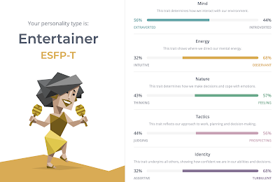
These days, there are many personality tests on the Internet that gives us a better understanding of our own personality type. The most popular one among them is the 16 personalities MBTI test, which is claimed to be one of the most reliable and accurate personality assessments available.
The result is given to us in a form of percentage diagram. It measures our preference on each of the spectrum. The numerical value shows how strong our dominant trait is comparing to its opposite number.
Based on the data given by the MBTI Institute, I created a bar diagram which shows the frequencies of MBTI types in the general population using Adobe Spark. The length of each bar represents the frequency of each personality type in terms of percentages.
Looking at this bar chart, you can tell which types are more common or rare than others and which scale your type fall on. As you can see, a bar diagram makes it easy to visualize the distribution of data and compare it between different groups at a glance.


Comments
Post a Comment